Tia Tina
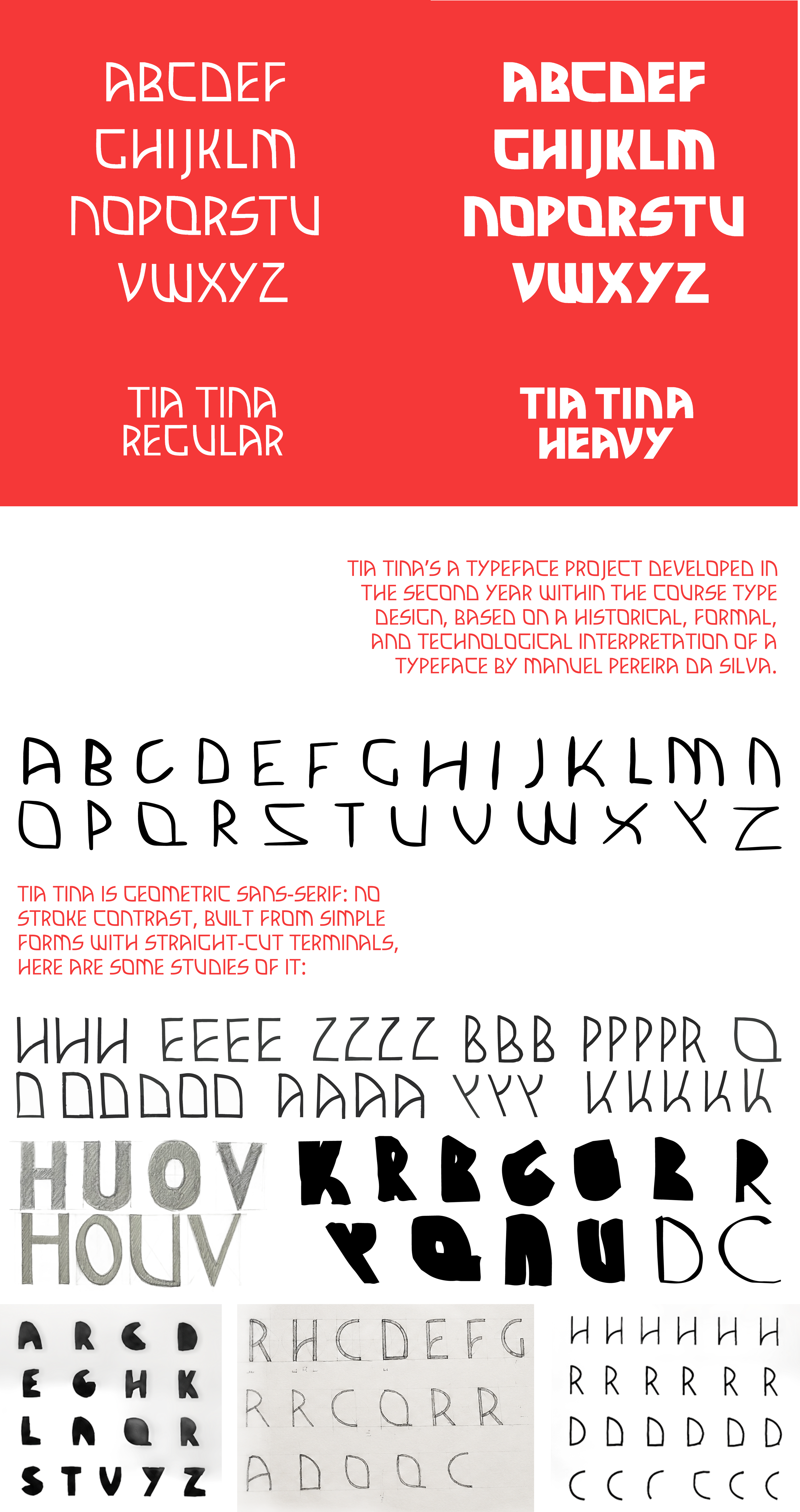
Tia Tina is a typeface project developed in the second year of a Communication Design degree, within the course Type Design, based on a historical, formal, and technological interpretation of a typeface by Manuel Pereira da Silva.
Stemming from the analysis of Tia Lira (2004), Tia Tina is a geometric sans-serif — no stroke contrast, built from simple forms, with straight-cut terminals. The matrix element was the letter A, built from the retro curve of Tia Lira's U, from which the remaining letterforms were derived to ensure structural and proportional consistency. Composed exclusively of Latin lowercase characters, it takes on an expressive, contemporary character.
The process moved through several stages of experimentation — iPad sketches and parallel-pen tests — before being systematised digitally, applying technical principles such as optical alignment, overshoot, and Bézier curve control.
Tia Tina
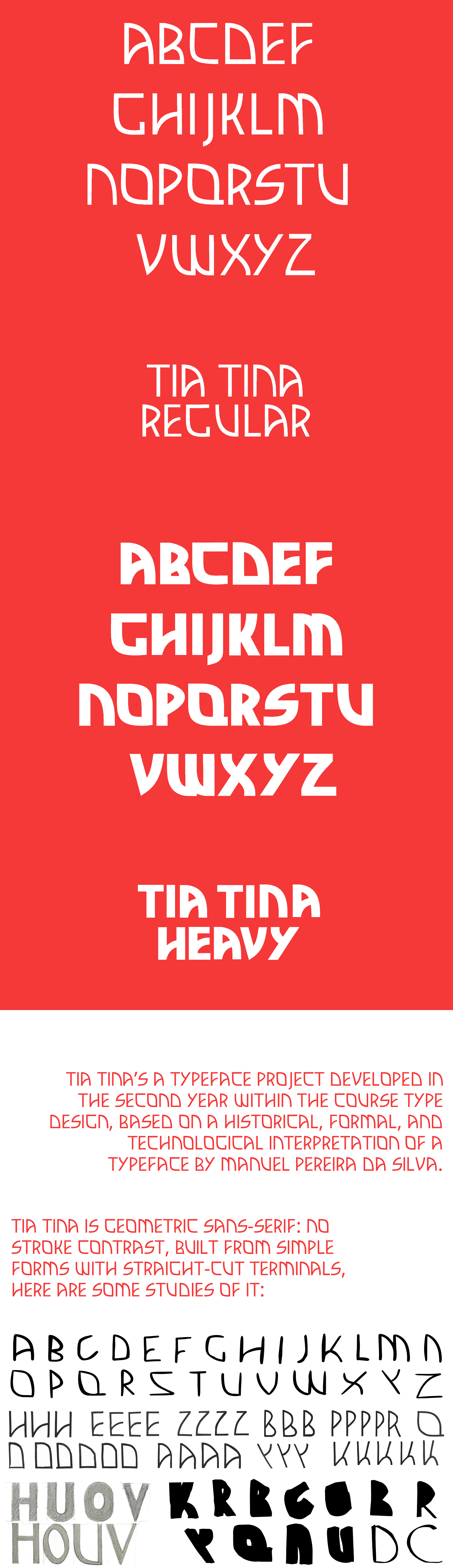
Tia Tina (2025) is a typeface project developed with my classmates Bruna Gonçalves and Teresa Lapa in the third year of my Communication Design degree, within the course Type Design, based on a historical, formal, and technological interpretation of a typeface by portuguese artist Manuel Pereira da Silva.
Stemming from the analysis of Tia Lira (2004), Tia Tina is a geometric sans-serif — no stroke contrast, built from simple forms, with straight-cut terminals. The matrix element was the letter A, built from the retro curve of Tia Lira's U, from which the remaining letterforms were derived to ensure structural and proportional consistency. Composed exclusively of Latin lowercase characters, it takes on an expressive, contemporary character.
The process moved through several stages of experimentation — iPad sketches and parallel-pen tests — before being systematised digitally, applying technical principles such as optical alignment, overshoot, and Bézier curve control.
Correntes d'Escritas 2026
Correntes d'Escritas 2026 is a typographic poster developed as a demonstration piece for Tia Tina, in a real communication context. The chosen event was Correntes d'Escritas 2026, a literary festival held in Póvoa de Varzim, establishing a conceptual link with the reference author behind the typeface.
Built on a simple modular grid and a reduced palette of black, white, and red, the poster explores repetition, hierarchy, and rhythm at large scale — showcasing the graphic and functional consistency of the typeface in a real-world setting.