por um fio
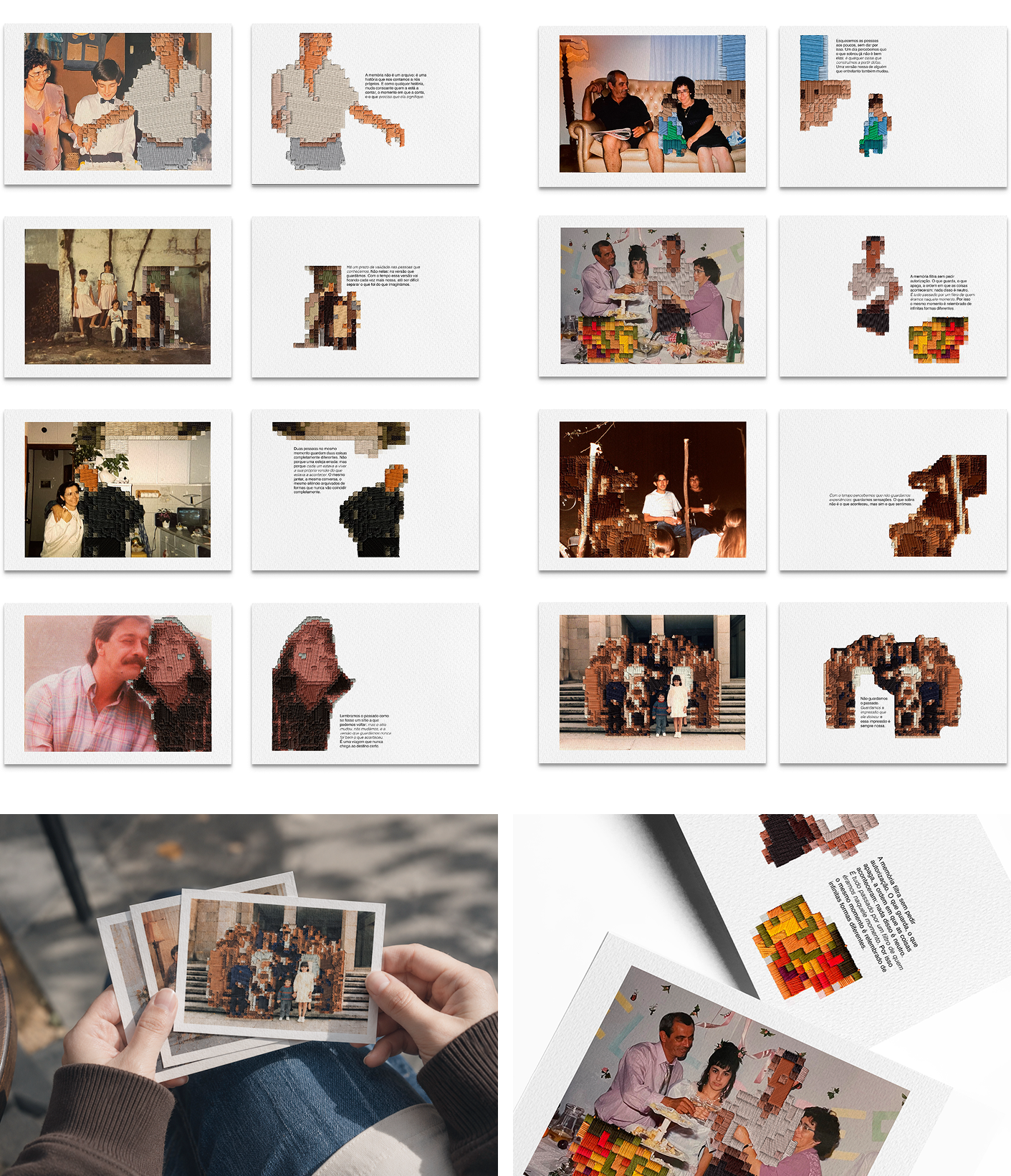
por um fio is an editorial design project developed in the third year of a Communication Design degree, within the course Editorial Design, from a brief to create a graphic object contained within a single A3 sheet.
The project explores the antithesis between the faithfulness of photography and the fragility of memory — photography fixes a moment exactly as it was, but what stays with us rarely matches what stayed in the image. From this tension, a collection of 8 A6 postcards emerged, built on old family photographs: images that raised questions, with people I don't recognise, places without context, and moments without a date.
Over these zones of unknowing, I intervened manually with embroidery, creating patches that cover and reinterpret what the photograph captured. The thread colours were chosen slightly more saturated than those of the image, accentuating the contrast between print and stitch. The front of each postcard follows a fixed layout that unifies the collection; the back is variable, with the embroidered patch as protagonist. The result is an object simultaneously rigorous and imperfect, editorial and handmade — exactly like a memory.
por um fio
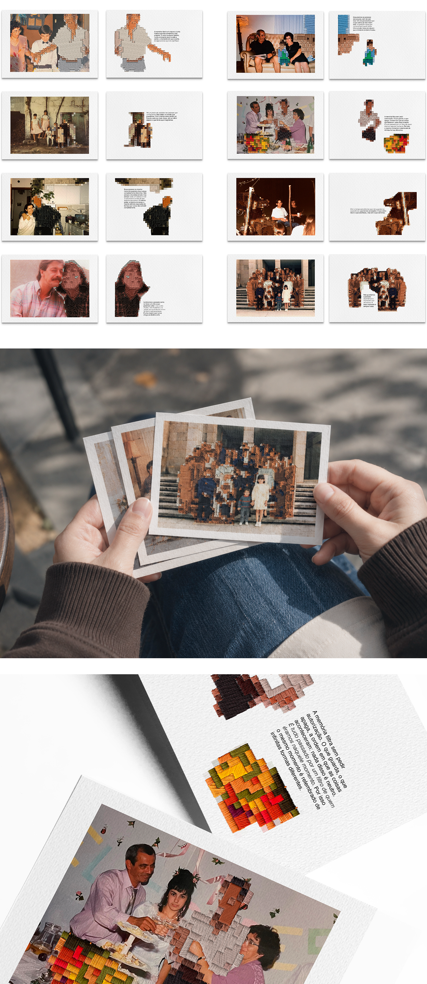
por um fio (2026) is an editorial design project developed in the third year of my Communication Design degree, within the course Editorial Design, from a brief to create a graphic object contained within a single A3 sheet.
The project explores the antithesis between the faithfulness of photography and the fragility of memory — photography fixes a moment exactly as it was, but what stays with us rarely matches what stayed in the image. From this tension, a collection of 8 A6 postcards emerged, built on old family photographs: images that raised questions, with people I don't recognise, places without context, and moments without a date.
Over these zones of unknowing, I intervened manually with embroidery, creating patches that cover and reinterpret what the photograph captured. The thread colours were chosen slightly more saturated than those of the image, accentuating the contrast between print and stitch. The front of each postcard follows a fixed layout that unifies the collection; the back is variable, with the embroidered patch as protagonist. The result is an object simultaneously rigorous and imperfect, editorial and handmade — exactly like a memory.